What Makes the Perfect PDP: Layouts That Convert
Learnings and advice from Paohaus’ founder.
TL;DR
While storytelling has its place in e-commerce, high-converting product detail pages rely on proven structural patterns rather than endless novelty. Paohaus breaks down the core architecture that actually drives revenue; from simplifying the classic image grid and buy box rail to rethinking size guides, leveraging branded AI, and deploying subtle micro-interactions that eliminate friction before it costs you a sale.
I've audited a lot of product pages over the years, and I keep coming back to the same conclusion: there's no single perfect template, but there are patterns that consistently work. Here's what I've seen actually move the needle and convert (the way marketing teams like 🤭).
Storytelling has a ceiling
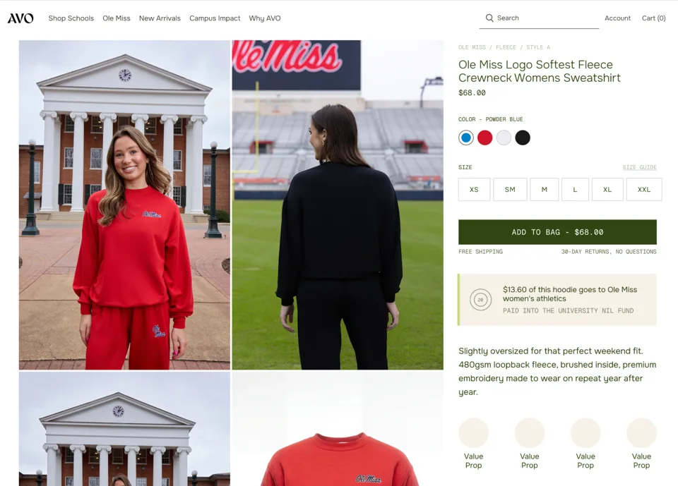
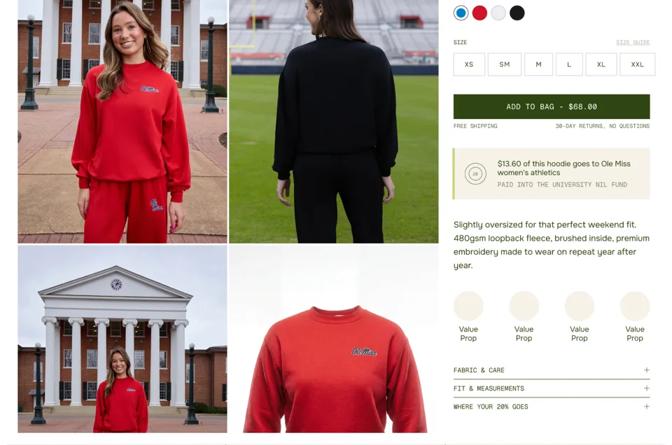
I love a PDP that tells a story. That moment of surprise when a page does something unexpected. But storytelling PDPs are inconsistent. They can be magic or they can slow the user down. The pages that convert reliably are simpler: an image grid on the left, and a right rail that keeps the add to cart button close to the title, with pricing built right in.
What goes in the right rail
Right under the title and price, an estimated ship date is huge if your fulfillment team can support it. Not every brand can, so the fallback is value props directly under the add to cart. The easy version is "30 day returns" and free shipping. The better version finds a more interesting way to say the same thing.
If you're using something like Tolstoy for shoppable video, that's another layer worth adding here too.
Images can do more work
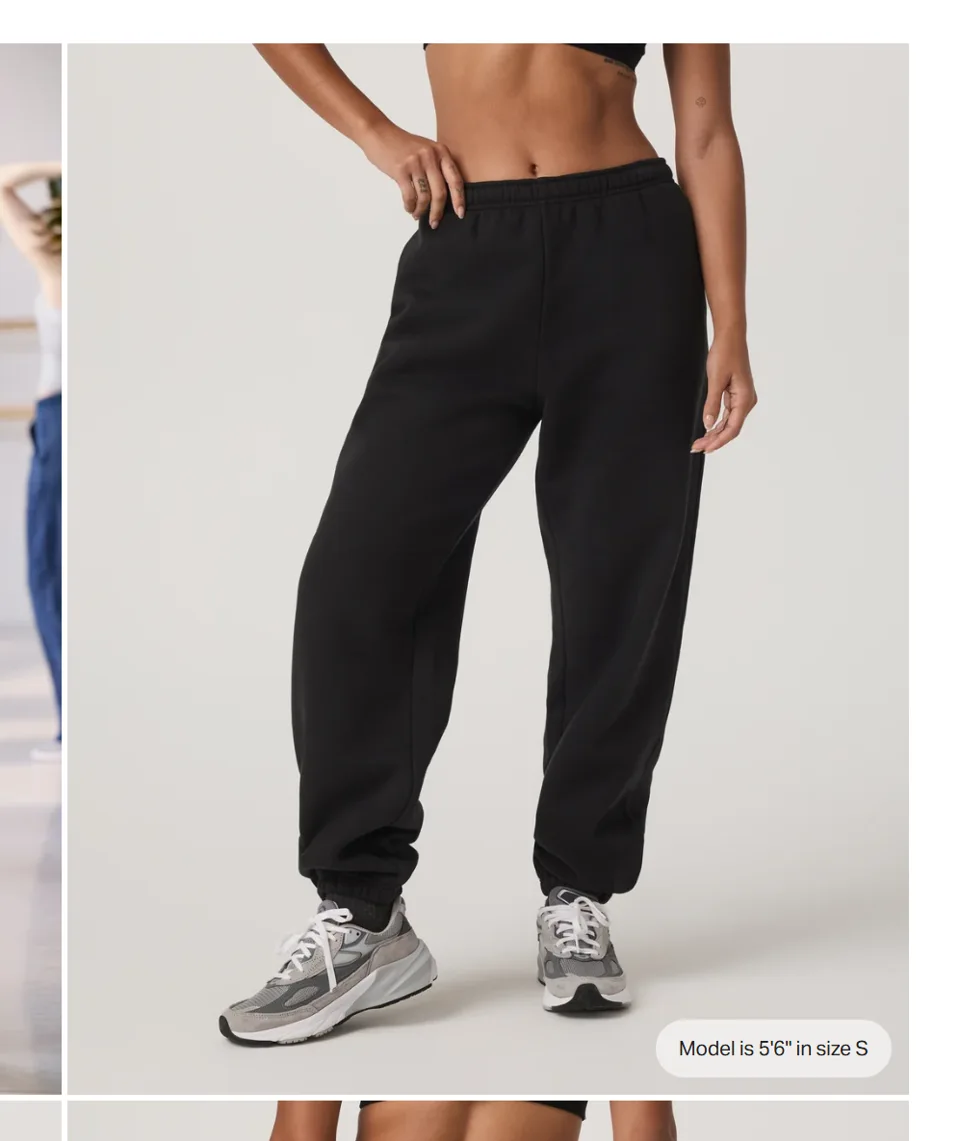
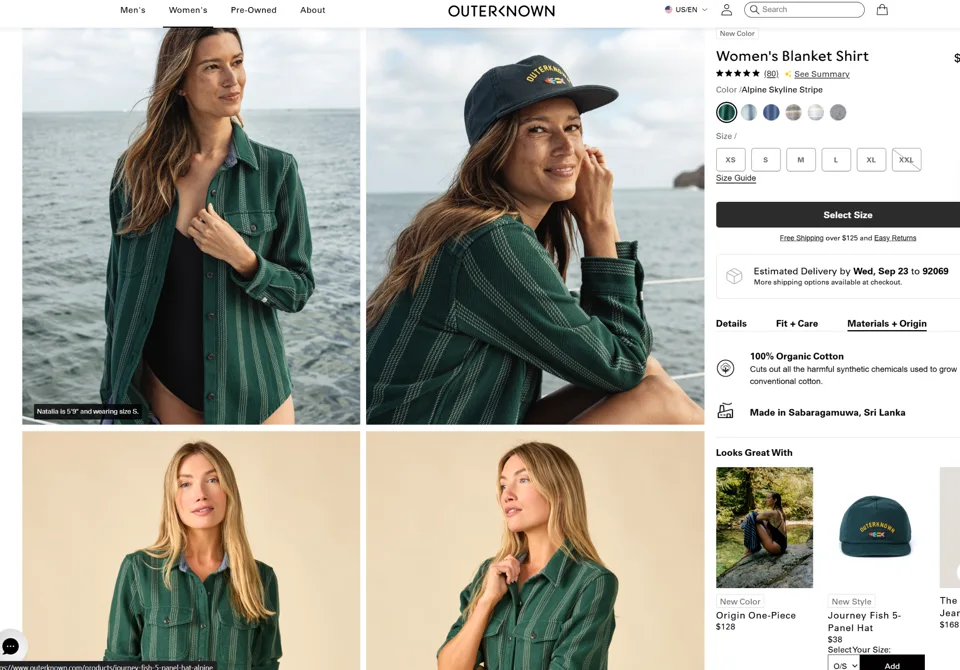
If you're a clothing brand, put the model's height and size right on the image, in the corner of one of the grid photos. It saves the user a trip to the size guide. One video above the fold in the gallery also helps. It creates movement, which pulls the eye through the rest of the images.
The one thing to watch is zoom. Some galleries let you zoom right in the grid, others force you to open the full image first and figure it out from there. If a user has a mental model of how zoom should work and your page doesn't match it, they may just give up.
Don't overload the fold
A lot of brands want to cram information below the fold, but people don't scroll that deep unless they're already invested. I'd rather put a small interactive trigger just above or slightly below the fold, with the key info highlighted. Yes, it adds a step. But it's happy friction: a small pause that helps the user instead of stopping them.
Size guides, redefined
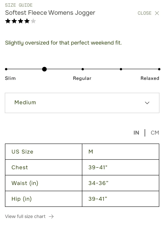
Most size guides throw every number at the user at once, and most of it isn't relevant to them. Show them the guide for their size first, and offer the full chart after if they want it. Less to process, faster to a decision.
Add an on-body infographic showing exactly how to measure, ideally built per product rather than reused across the whole catalog. It keeps things consistent and gives the user a real sense of how the fit will land.
Pair that with a fit scale, but split it into two signals. Pull actual fit feedback from reviews (runs small, true to size, runs large) and put that at the top since it reflects how real people experienced it. Then separately, note the intended fit in words: if something is designed oversized but a reviewer says it ran tight, the user needs to see both. The scale should be driven by social proof. The intent is a design fact, and it shouldn't get blended into the same slider.
If you're an inclusive brand, showing the product on models of different sizes is a heavier lift, but it matters. Nuuly does this well, and their social proof adds to it since so many customers post their own photos wearing the product. Between the two, a user gets a much clearer read on how something is actually going to fit them.
Product ratings belong up top
Right under the product name, not buried lower on the page. This is close to a make or break for me. When we’re talking about e-comm, we’re talking about users that are basing their entire purchase on what they see online about your product. Reviews carry major weight here, and shoppers (rightfully) rely on the opinions of other users to decide if what you’re selling is right for them and what size or style they want. Personally, I think brands should be more transparent about curation within their reviews, but that's my own opinion.
For high variation/style products
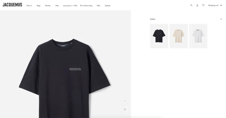
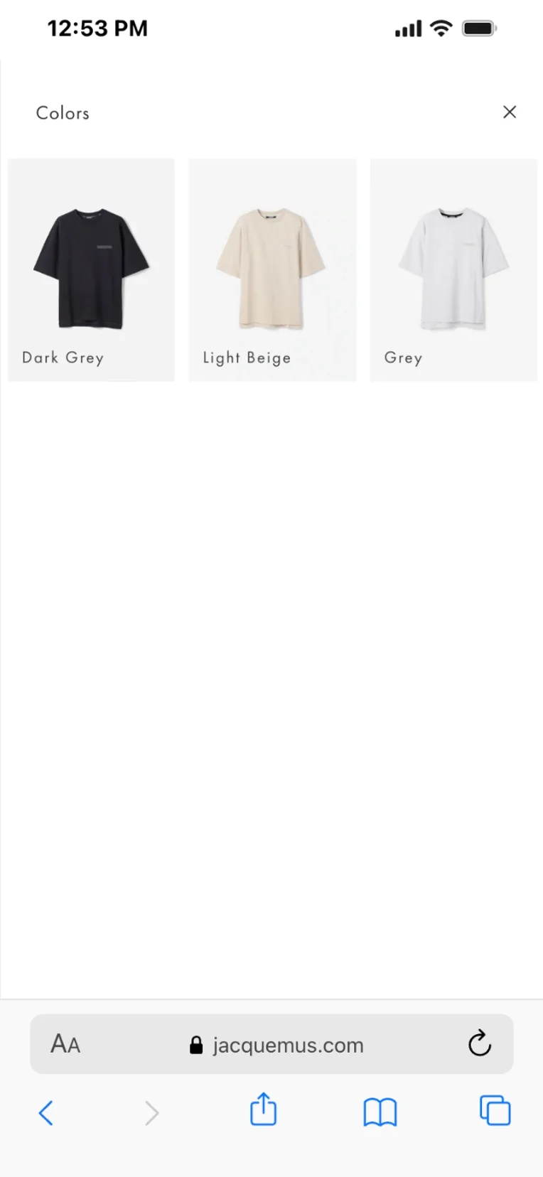
If a product has a lot of style options, give the user a modal to browse every lifestyle image without leaving the page. They keep their place, they keep the add to cart, and they can flip through every variant. It's a step past a compare tool, but it does similar work.
Sticky add to cart, placement matters
On desktop, keep it near the top, closer to the cart icon. That matches how people already think about starting a purchase, though I'd want to validate that with real data rather than gut feel. On mobile, it belongs at the bottom, in a tappable spot. If you can let someone pick their size from that sticky bar instead of scrolling back up, that's a better experience.
Micro-interactions
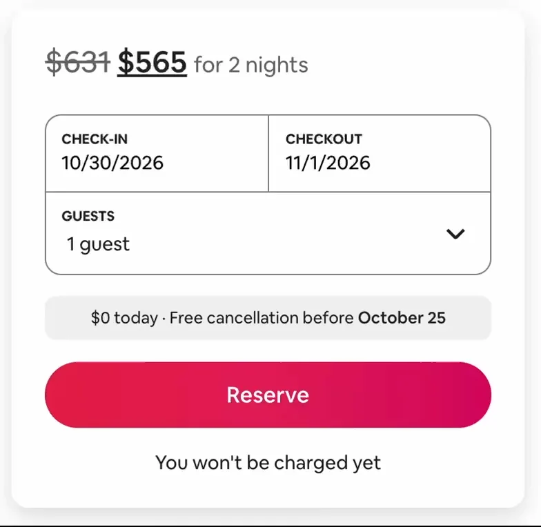
These are underused and they carry a lot of weight. The add to cart button is a good place to start. On hover, or as the user scrolls past it, a subtle gradient shift can make the button feel alive without being distracting. Airbnb does this well on their buttons, it's a small touch, but it's well executed. That kind of detail is worth adding to a PDP too.
AI on PDPs, done right
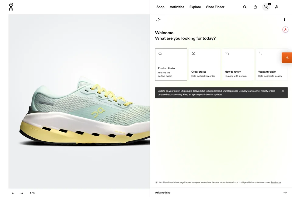
I was skeptical of this a year ago. But after testing it, I've changed my mind (as we do in UX, right?). It surfaces real signal on what people are actually looking for in your products, and that feeds back into your content. The one rule I'd hold onto: brand it. On Running has done this well, where the assistant feels like part of their world instead of a bolted on chat widget.
Accordions still work
People push back on hiding information in tabs, but for higher priced products, guided disclosure helps. Someone about to spend real money is a little nervous. Walk them through it: look at this, then this. Don't hand them everything at once.
Bundling and upsells
One rail of upsells performs better than two, in my experience, even though two used to be more common. Bundling can sit right under the accordions on the right rail, or in a few other spots, as long as it's present. One thing I haven't tested yet but suspect works well: "styled with" suggestions at add to cart, or a full matching set upsell if it applies. Either way, make the decision easy to find and easy to make.
A few more worth testing
A couple of smaller details keep showing up on the highest performing pages right now:
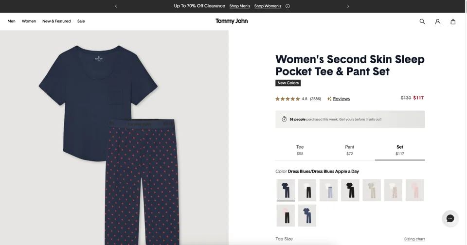
- Swatches instead of dropdowns for color and variant selection. They're faster to scan.
- Greying out sold out variants instead of hiding them, so the user isn't confused about what exists.
- Making sure the whole buy box, title, image, price, and add to cart, fits in one screen with no scrolling.
- Cross-sells at the very bottom of the page for shoppers who got close but didn't convert on that product.
None of this is a formula. It's a set of patterns I trust, and every brand still has to test against its own audience.
Small signals, bigger story
Notify me when out of stock. Simple, but it turns a dead end into a reason to come back instead of a reason to leave. It tells the user you'll actually let them know, which keeps them from bouncing to a competitor mid intent.
Stock urgency on the color label, but subtle. Once a color drops below a threshold, a small note under the swatch works better than a banner. Something like "only 3 left" near the color name, not flashing across the page. It nudges without pressuring.
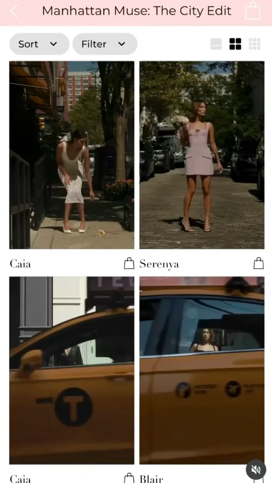
The most interesting idea I've come across recently was a grid that told a story across images instead of within one. Someone posted an example on LinkedIn: the first photo is on a New York street, a cab rolls through the frame for a second. In the next photo, a different model, the same cab passes again but a beat later, like the two moments are happening in the same world just seconds apart. It's a small trick, but it makes a flat grid feel like it's moving even when nothing on the page actually is.
Putting it all together
Making the perfect PDP isn’t as simple as following a set of rules (if only). Start by considering your users, how they shop, and what information they need to make a decision. Then, consider your product lineup; how complicated is it? How many variants are you working with on average? Use the combination of these insights to pull the building blocks you need to create the ideal product detail page for your business.
Right now, the image grid on left, detail on right rail model works practically universally, but like all things in the UX world, I expect that to change at some point in the future. That’s why you should always be running tests, monitoring heat maps, and seeing how real users interact with your site in real time. The best companies, sites, and products in the world are constantly evolving to keep up with changing user behaviors and expectations.
Want help creating your perfect PDP? Get in touch with the Paohaus team here.